Discover Stunning Color Palette Ideas for Your Next Project
Introduction to Color Palette Ideas
Choosing the right color palette can dramatically impact the mood and aesthetics of any project, whether it's for graphic design, fashion, interior decor, or branding. This article delves into diverse color palette ideas that spark creativity and elevate your work. Let’s explore some inspiring concepts along with tips and best practices to help you select the perfect colors for your next endeavor!
Understanding Color Theory
Before diving into specific ideas, it's crucial to understand the basics of color theory. The color wheel is a fundamental tool that illustrates how colors interact. The three primary colors—red, blue, and yellow—combine to form secondary colors, which include green, orange, and purple. Understanding these relationships helps in creating harmonious and visually appealing palettes.
Classic Color Palette Ideas
Classic color schemes are timeless and versatile. Here are a few ideas:
- Monochromatic: Variations of a single hue create a cohesive and elegant look. For example, using different shades of blue can evoke calmness and serenity.
- Complementary: Colors opposite each other on the color wheel (e.g., blue and orange) can create dynamic and vibrant combinations. This palette is excellent for marketing materials, as it draws attention.
- Analogous: These are colors that sit next to each other on the color wheel, such as red, red-orange, and orange. They create a serene and comfortable design.
Table of Classic Color Palette Ideas
| Color Scheme | Description |
| Monochromatic | Variations of a single hue for a cohesive look. |
| Complementary | Opposite colors for vibrant contrast. |
| Analogous | Colors next to each other for a serene feel. |
Trendy Color Palette Ideas
Current trends can inspire fresh color palettes. Here are some of the most sought-after ideas:
- Pantone's Color of the Year: Each year, Pantone announces a color that captures the global mood. Incorporating this color into your palette can make your designs feel modern and in tune with current trends.
- Earth Tones: Shades like terra cotta, ochre, and leafy greens resonate with sustainability and nature, making them ideal for organic brands and eco-friendly initiatives.
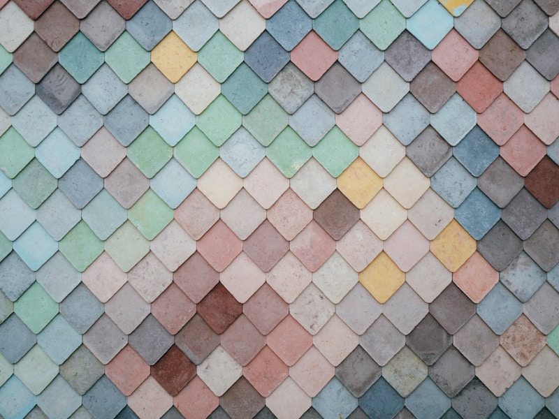
- Pastel Colors: Soft hues such as blush pink, mint green, and baby blue create a light and airy feel, perfect for wedding invitations and children's products.
Exploring Innovative Color Combinations
Innovation often lies in unexpected color combinations. Here are a few to consider:
- Bold and Bright: Pairing a bright coral with deep navy can create striking visuals. This is excellent for creative projects that seek to make a statement.
- Muted Tones with Bright Accents: Using soft colors like gray and beige with pops of bright orange or turquoise adds interest without overwhelming the viewer.
- Neon Meets Natural: Bold neon colors juxtaposed with earthy, natural tones can create a unique and appealing contrast that draws the eye.
Utilizing Online Tools for Color Palette Ideas
The digital age offers numerous tools that can help in generating color palette ideas. Websites like Adobe Color and Coolors.co allow users to experiment with colors, generate palettes based on existing images, and see how different color combinations can look in various contexts.
Color Psychology: The Impact of Color on Emotions
Colors can evoke emotions and influence perceptions. Understanding color psychology is crucial when selecting a palette:
- Red: Often associated with passion and energy, it's a great choice for brands wanting to convey excitement.
- Blue: Known for its calming effect, blue works well for corporations and technology brands.
- Green: Symbolizing health and tranquility, green is perfect for organic products and wellness brands.
Summary of Color Palette Ideas
Color palettes are more than just aesthetic choices; they play a significant role in communication and branding. Understanding classical color theory, current trends, and innovative combinations can empower you to create compelling visuals that resonate with your audience. Always consider color psychology and the emotional response you wish to elicit when choosing your palette.
Conclusion: Final Thoughts and Recommendations
In summary, the right color palette ideas can transform your projects from ordinary to extraordinary. Whether you choose classic, trendy, or innovative palettes, always align your choices with the emotions you want to evoke. As you experiment with different combinations, keep the principles of color theory and psychology in mind to ensure your designs are visually appealing and effective.
Should you require further inspiration, don't hesitate to explore additional resources or seek feedback from peers or online communities. Happy designing!
