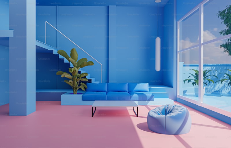
Creating Balance with Color: A Comprehensive Guide to Achieving Aesthetic Harmony in Design
Color plays a pivotal role in our lives, influencing our emotions, perceptions, and even decisions. Understanding how to create balance with color is essential for anyone involved in design, whether you're an interior decorator, graphic designer, or simply looking to beautify your home. In this article, we'll delve into the principles of color theory, strategies for achieving a balanced color palette, and practical applications that can elevate your environments and projects.
The Psychology of Color
Before we dive into creating balance, it's important to understand how colors affect our emotions and perceptions. For instance:
| Color | Emotion |
| Red | Passion, energy |
| Blue | Calmness, trust |
| Yellow | Happiness, optimism |
| Green | Growth, health |
| Purple | Lavishness, creativity |
Understanding these associations can help you select colors that not only look appealing but also resonate with the intended mood of your space or design project.
Principles of Color Theory
1. The Color Wheel
The color wheel is a fundamental tool in color theory. It consists of primary, secondary, and tertiary colors. Understanding the relationships between these colors can guide your choices:
- Primary Colors: Red, Blue, Yellow
- Secondary Colors: Green, Orange, Purple (created by mixing primary colors)
- Tertiary Colors: Created by mixing a primary color with a secondary color (e.g., Red-Orange)
2. Color Harmonies
Color harmonies are combinations of colors that produce pleasing effects. Here are a few classic schemes:
- Complementary: Colors opposite each other on the wheel (e.g., blue and orange)
- Analogous: Colors next to each other (e.g., blue, blue-green, and green)
- Triadic: Three colors evenly spaced (e.g., red, yellow, and blue)
Creating Balance with Color in Different Design Aspects
1. Interior Design
Creating balance in interior design often involves establishing a cohesive color scheme throughout the space. Here are some tips:
- Choose a Dominant Color: Select a primary color to anchor the room's design.
- Add Accent Colors: Use complementary or analogous colors for decorations and accessories.
- Neutral Background: Consider using neutral tones for larger furniture or walls to allow for color pops without overwhelming the room.

2. Graphic Design
In graphic design, color balance is critical for visual hierarchy. Here are a few best practices:
- Limit Your Palette: Stick to 2-4 main colors to maintain clarity.
- Create Contrast: Use contrasting colors for text and backgrounds to ensure readability.
- Brand Consistency: Stick to a consistent color palette that aligns with your brand identity.
3. Fashion Design
In fashion, creating balance with color can dictate the vibe of an outfit. Here are some considerations:
- Complement Skin Tones: Choose colors that flatter your skin tone to create a balanced look.
- Accessorize Wisely: Use accessories to introduce pops of color without overwhelming the outfit.
- Seasonal Colors: Utilize seasonal palettes to maintain relevance in fashion trends.
Common Mistakes to Avoid
While understanding color balance is essential, avoiding common pitfalls is equally important:
- Overusing Bright Colors: Bright colors can overpower a room or design. Use them sparingly.
- Ignoring the Environment: Ensure that the colors you choose work well in the lighting of the space.
- Neglecting Texture: Different materials reflect color differently. Consider how fabric, paint, or finishes will influence your color choices.
Conclusion
Creating balance with color is both an art and a science. By understanding the psychological effects of color, utilizing the color wheel, and applying these principles across various design mediums, you’ll be well-equipped to enhance your projects' aesthetic appeal. Remember, the key to achieving balance lies in thoughtful selection and harmonious application of color.
As you navigate your next design endeavor, consider these tips on choosing your color palettes and always be mindful of the emotional impact of your choices. Whether you're designing an interior space, crafting a marketing piece, or putting together an outfit, the right colors can make all the difference.
For those interested in further exploring this topic, related search terms such as "color theory for interior design," "color psychology in branding," and "fashion color trends" can yield valuable insights.