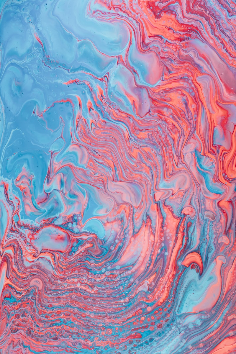
Artful Harmony: Mastering the Art of Mixing Colors and Textures
Introduction
In the vibrant world of art and design, few elements carry as much weight as color and texture. The way we mix colors and textures can significantly influence the emotional tone of a space, artwork, or even fashion. This article will explore the intricate dance of mixing colors and textures, offering insight into techniques, applications, and the impact of these elements on our daily lives.
The Basics of Color Theory
Before diving into the nuances of mixing colors and textures, it’s essential to grasp the fundamentals of color theory. At its heart, color theory is a guide to understanding how colors interact with one another.
Primary, Secondary, and Tertiary Colors
Colors are generally classified into three categories:
| Type | Example Colors |
| Primary Colors | Red, Blue, Yellow |
| Secondary Colors | Green, Orange, Purple |
| Tertiary Colors | Red-Orange, Yellow-Green, etc. |
Understanding these categories will aid in making informed decisions when mixing colors to create harmony in your work.
Understanding Textures
Just like colors, textures play a crucial role in visual appeal. Texture refers to the surface quality of an object. It can be tactile (how a surface feels) or visual (how a surface looks). Combining various textures can add depth and interest to your projects.
The Role of Texture in Design
In design, the thoughtful blending of textures can transform an ordinary space into an extraordinary one. For instance, think of a living room that combines a soft wool sofa with a sleek leather chair and a rough wooden coffee table. This juxtaposition creates a dynamic aesthetic that invites curiosity and comfort.
Techniques for Mixing Colors and Textures
Now that we have established the importance of colors and textures, let’s explore some effective techniques for mixing them.
1. The 60-30-10 Rule
This rule is a time-tested guideline for balancing colors in a space or design. The idea is to use 60% of a dominant color, 30% of a secondary color, and 10% of an accent color. This principle can be applied to both colors and textures.
2. Analogous and Complementary Colors
When mixing colors, employing analogous colors (colors that are next to each other on the color wheel) can create a serene and comfortable look. Conversely, complementary colors (colors opposite each other on the color wheel) can bring excitement and vibrancy to a design.
3. Layering Textures
Layering different textures can add richness to your designs. Start with a base texture, like a soft fabric, and add contrasting textures like metal or glass. This technique will create visual interest and depth.
Incorporating Mixing Colors and Textures in Different Fields
Mixing colors and textures is not confined to traditional artistic endeavors; it can be utilized in various fields, including interior design, fashion, and graphic design.
Interior Design
In interior design, harmoniously mixing colors and textures can transform a room. Consider a bedroom adorned with a soft velvet bedspread, chunky knitted throws, and crisp cotton sheets. The combination of these textures, along with a palette of pastel colors, can create a serene retreat that reflects personal style.
Fashion
Fashion designers frequently mix colors and textures to produce unique garments. For instance, a bright silk blouse paired with denim or leather can create a striking and fashionable ensemble. This approach resonates particularly well in the current fashion landscape, where individuality is celebrated.
Graphic Design
In graphic design, color and texture are pivotal in conveying messages and evoking emotions. A vibrant color palette coupled with varied textures, such as gradients or patterns, can capture attention and enhance usability in digital products.
Case Studies of Successful Mixing
Let’s explore a few real-life examples of successful color and texture mixing in different fields.
Case Study 1: Pantone’s Color of the Year
Each year, Pantone selects a "Color of the Year" that influences design trends across various industries. For example, Pantone 2023’s selection of “Viva Magenta” captures attention with its vividness. In fashion, this bold color mixes beautifully with soft fabrics like chiffon, providing a striking visual contrast.
Case Study 2: High-End Interior Design
Consider a high-end restaurant that seamlessly mixes dark wood, marble, colorful upholstery, and metallic accents. The texture variations enhance the dining experience, creating a space that feels both luxurious and inviting. By expertly mixing colors and textures, designers can shape environments that leave lasting impressions.
Common Mistakes to Avoid
Despite the guidelines available, mixing colors and textures can sometimes lead to overwhelming or mismatched results. Here are some common mistakes to avoid:
1. Overusing Colors
Too many colors can create visual clutter. Stick to a cohesive color palette to maintain balance.
2. Ignoring Texture Balance
While mixing textures, ensure you have both soft and hard textures to create a balanced look. A room filled only with soft textures may lack interest.
3. Failing to Consider Scale
When mixing textures, keep the scale in mind. Larger textures can overpower smaller ones, leading to an unbalanced design.
Conclusion: The Art of Mixing Colors and Textures
Mixing colors and textures is an art that requires knowledge, experimentation, and a keen understanding of design principles. By understanding the basics of color theory, the role of texture, and various techniques, you can create captivating designs that resonate with viewers. Remember to explore different fields—interior design, fashion, and graphic design all offer unique opportunities to showcase your talents in this area.
In summary, embrace the beauty of mixing colors and textures, and don’t be afraid to experiment. By avoiding common mistakes and applying the techniques discussed, you can elevate your creative endeavors to new heights. Happy designing!
