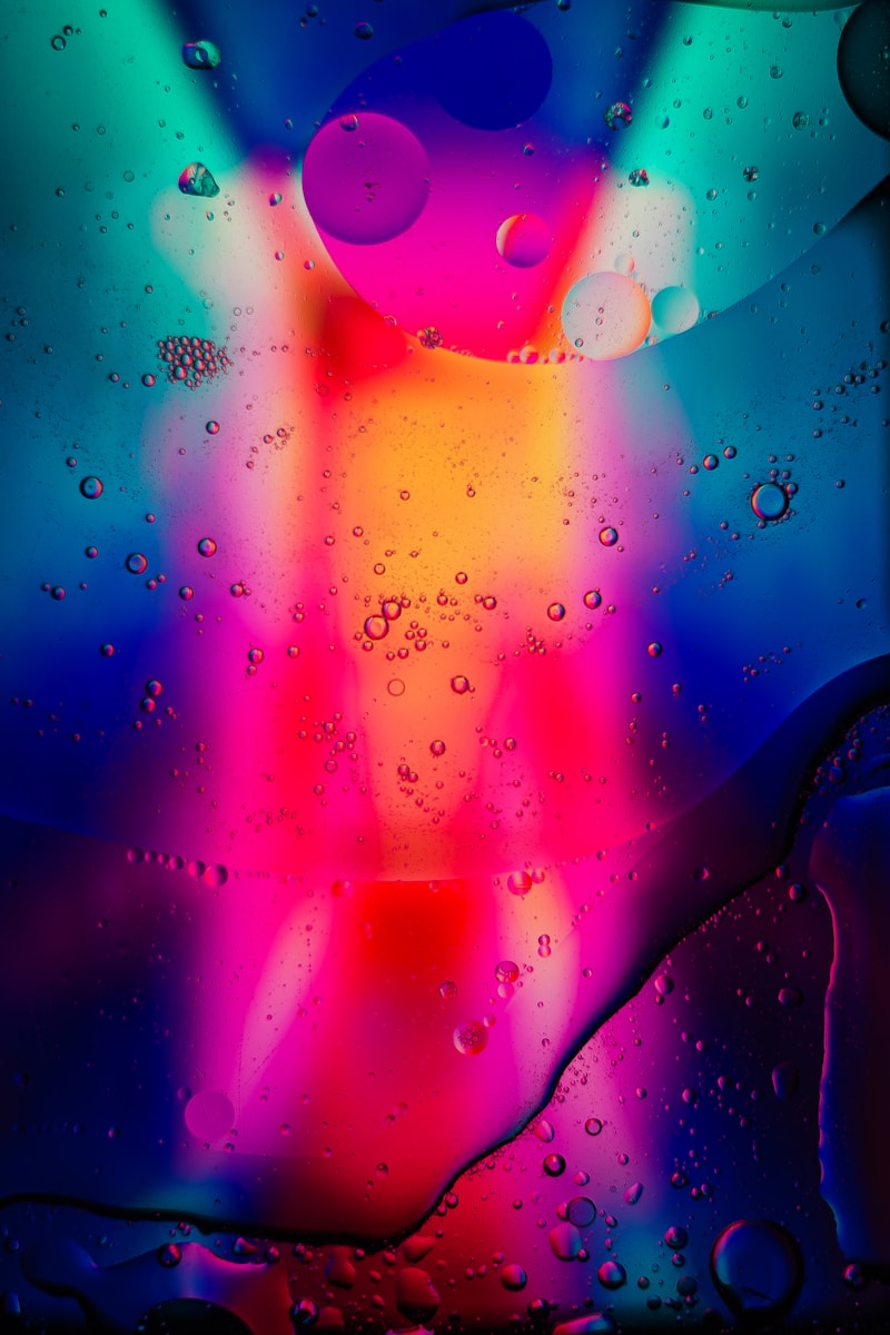
Unveiling Stylish Color Palettes: Your Comprehensive Guide to Choosing the Perfect Colors
Understanding Stylish Color Palettes
Whether you're a graphic designer, interior decorator, or just someone eager to enhance their aesthetic, knowing how to select the right color palette is essential. Stylish color palettes can make or break the visual appeal of your project, influencing emotions and perceptions.
What Are Stylish Color Palettes?
A color palette is a collection of colors that are used together in design. The term "stylish" suggests that these color combinations are not only visually appealing but also modern and relevant to current trends. More than just personal preference, the choice of colors can create mood, highlight a theme, or even enhance functionality.
The Importance of Color Psychology
Colors evoke emotions and signal different meanings. Here’s a brief overview of some common colors and their psychological associations:
| Color | Emotion | Usage |
| Red | Passion, Energy | Sales, Warnings |
| Blue | Calm, Trust | Corporate Branding |
| Green | Harmony, Growth | Health, Nature |
| Yellow | Optimism, Cheerfulness | Creative Spaces |
| Black | Elegance, Sophistication | Luxury Brands |
| White | Purity, Simplicity | Modern Design |
How to Create Your Stylish Color Palette
Designing a stylish color palette involves several crucial steps:
1. Define Your Purpose
Before you start mixing colors, determine the purpose of your project. Are you designing a website, an interior space, or a graphic piece? The purpose will guide your color choices.
2. Gather Inspiration
Look for inspiration in nature, fashion, art, or any area that resonates with you. Platforms like Pinterest and Instagram are excellent resources for visual ideas.

3. Choose a Color Scheme
Here are some popular color schemes that can serve as a foundation for your stylish palette:
- Monochromatic: Variations of a single color.
- Analogous: Colors adjacent to each other on the color wheel.
- Complementary: Colors opposite each other on the color wheel.
- Triadic: Three evenly spaced colors on the color wheel.
4. Test Your Colors
Before finalizing your palette, visualize the colors in your design. Use mockups or prototypes to see how they work together in different contexts.
Stylish Color Palettes: Trending Combinations
Trends can change, but some stylish color palettes have proven to be timeless. Here are a few trending combinations that resonate well:
- Coral and Teal: This vibrant yet calming blend is perfect for creative spaces.
- Mustard and Navy: A bold and sophisticated pairing suitable for professional settings.
- Pastels: Soft tones like lavender, mint, and blush invoke calm and serenity.
- Earthy Tones: Rich browns, greens, and rust can create a warm, homely atmosphere.
- Classic Black and White: Timeless elegance that fits any context.
Case Studies: Stylish Color Palettes in Action
To see how stylish color palettes can transform a space or design, let’s review a couple of case studies:
1. The Modern Office Space
A tech startup wanted to create a creative work environment that inspired innovation and collaboration. They chose a palette combining shades of blue and green to signify trust and growth, paired with pops of yellow to encourage optimism and creativity.
2. A Chic Wedding Theme
For a wedding focused on elegance, the couple selected a sophisticated palette of dusty rose, navy, and gold. This combination conveyed romance while adding a touch of luxury.
Conclusion and Best Practices for Stylish Color Palettes
In summary, stylish color palettes play a crucial role in effective design and communication. Whether you’re working on an interior design project, a branding endeavor, or simply want to revamp your digital presence, the colors you choose will impact how your audience perceives your work.
Here are some best practices to ensure your palette is both stylish and effective:
- Always consider the context and purpose of your design.
- Keep your target audience in mind; different demographics may respond to colors differently.
- Don’t rush the process. Take your time to test out various combinations before settling on a final palette.
- Stay updated with current trends while also considering timeless combinations that suit your vision.
With these insights, you’ll be well on your way to mastering the art of stylish color palettes. Happy designing!