Exploring Bold Color Juxtapositions in Art and Design
Introduction to Bold Color Juxtapositions
Color is a powerful tool in art and design, capable of evoking emotions, setting the mood, and creating stunning visuals. Among the many color strategies available to artists and designers, bold color juxtapositions stand out as a particularly dynamic approach. This technique involves pairing contrasting colors in a striking manner, leading to captivating visual experiences. In this article, we’ll delve into the concept of bold color juxtapositions, explore their psychological impacts, examine how they are utilized in various fields, and provide tips for effectively integrating them into your own projects.
Understanding Bold Color Juxtapositions
Bold color juxtapositions are all about the dramatic contrast between colors that are oppositional or complementary on the color wheel. When colors are placed together, they not only enhance each other but also create a visual tension that can be incredibly engaging. This technique has been used in various artistic movements, from Impressionism to modern graphic design, and can be applied in fashion, interior design, and branding. Understanding how to effectively create these contrasts is essential for anyone in a creative field.
The Psychology of Color in Juxtaposition
Colors can have profound effects on viewers’ emotions and perceptions. Bold juxtapositions can create feelings of excitement, energy, and sometimes even discomfort. For example, pairing a vibrant orange with a deep blue can evoke a sense of vibrancy and movement, whereas a bright pink next to a dark green can create tension due to their stark differences. Color psychology plays a crucial role in how these combinations are interpreted, which is why understanding your audience is key.
| Color Pairing | Emotional Impact |
| Red & Green | Festive, Energetic |
| Blue & Orange | Dynamic, Vibrant |
| Purple & Yellow | Royalty, Cheerfulness |
| Black & White | Classic, Timeless |
Applications of Bold Color Juxtapositions
From the world of fine art to contemporary design, bold color juxtapositions can be found in various applications:
1. Painting and Fine Art
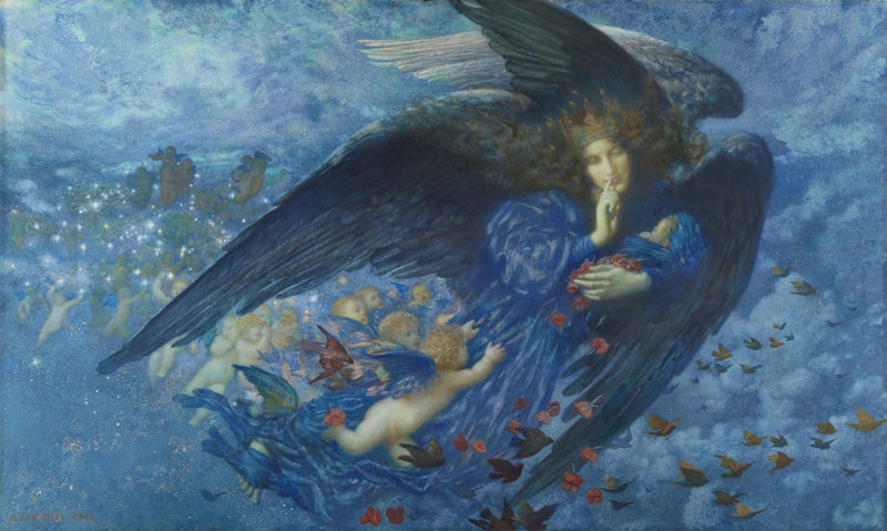
Many renowned artists have used color juxtapositions to create impactful works. For instance, the paintings of Vincent van Gogh, who brilliantly used bold colors such as yellows and blues, offer striking examples of how color can influence the mood of a piece. His famous painting "Starry Night" utilizes contrasting colors to create movement and emotion, showcasing the effectiveness of this technique.
2. Graphic Design
In graphic design, bold color juxtapositions are frequently used to draw attention and create brand identity. Websites and advertisements often rely on stark contrasts to guide viewers’ eyes to key areas, such as calls to action. A well-executed color scheme can make a brand memorable. For example, the use of bright colors on social media graphics can significantly increase engagement rates.
3. Interior Design
Interior designers also leverage bold color juxtapositions to create unique atmospheres within spaces. For example, pairing a deep navy blue with bright yellow accents can evoke a modern and energetic environment, making rooms feel alive and inviting. Homeowners and designers alike can manipulate color contrasts to reflect personal styles, evoke particular moods, and enhance the functionality of spaces.
4. Fashion Design
The world of fashion thrives on bold color juxtapositions. Designers often create collections that utilize striking contrasts much like artists. For instance, a collection may feature vibrant reds paired with pastel pinks, creating visual interest and enticing consumers. By embracing this approach, fashion brands can stand out in a crowded marketplace and attract attention at fashion weeks worldwide.

Tips for Implementing Bold Color Juxtapositions
Now that we understand the fundamentals of bold color juxtapositions, let’s explore some practical tips to help you incorporate this technique into your own work:
1. Start with a Color Wheel
Using a color wheel can guide you in finding complementary or contrasting colors that work well together. Choose colors that resonate with the emotions you aim to evoke in your audience.
2. Balance is Key
While bold juxtapositions are effective, striking a balance is essential. Use one bold color as the dominant shade while allowing a secondary, quieter color to support it, preventing visual chaos.
3. Consider Context
Think about how your color choices fit within the context of your project. A vibrant, playful scheme might work for a children’s brand but could be overwhelming for a luxury product. Tailor your choices to suit the audience and purpose.
4. Experiment and Iterate
Feel free to experiment with different combinations and placements. Digital tools and apps can help you visualize colors side by side before finalizing your choice.
Conclusion
Bold color juxtapositions offer a thrilling avenue for artists and designers to express their creativity. By understanding the emotional impacts of color, utilizing these contrasts effectively, and applying them thoughtfully in various fields, you can create substantial visual narratives that resonate with your audience. As you embark on your journey of integrating bold color juxtapositions into your work, remember to experiment, find your unique style, and always keep your audience's perception in mind. Happy designing!