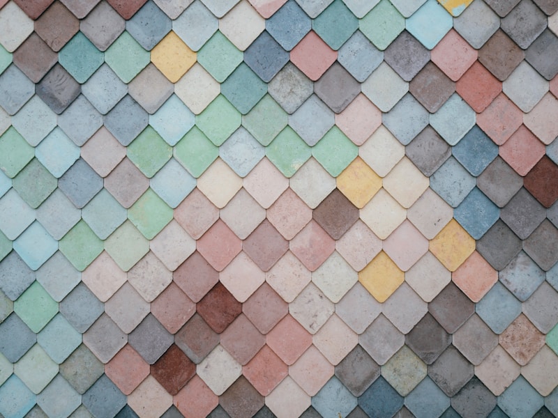
Bridging Colors with Patterns: A Comprehensive Guide to Harmonizing Design
Understanding the Art of Color and Pattern Integration
In the world of design, whether it be in fashion, interior decoration, or graphic design, the ability to effectively bridge colors with patterns is an essential skill. This article delves deeply into how to master this art, exploring techniques, tips, and the psychology behind color and pattern choices.
The Importance of Color
Color plays a pivotal role in how we perceive designs and environments. It evokes emotions, creates moods, and can even influence behavior. Understanding color theory is foundational for anyone looking to integrate colors with patterns effectively.
Basic Color Theory
At its core, color theory encompasses three primary components: the color wheel, color harmony, and the context of colors. The color wheel is a tool that helps designers understand how colors interact with one another.
| Primary Colors | Red, Yellow, Blue |
| Secondary Colors | Green, Orange, Purple |
| Tertiary Colors | Red-Orange, Yellow-Orange, Yellow-Green, Blue-Green, Blue-Purple, Red-Purple |
The Psychology of Colors
Colors evoke different psychological responses. For instance:
- Blue: Often associated with calmness and stability.
- Red: Represents passion and energy.
- Green: Symbolizes nature and tranquility.
Patterns: The Visual Language
Patterns add texture and depth to designs. They can range from simple shapes to complex illustrations, serving to create movement and interest within an overall aesthetic.
Types of Patterns
Understanding the various types of patterns is crucial for integrating them with colors:
- Geometric Patterns: These include repetitive shapes like triangles, squares, and circles.
- Floral Patterns: Usually characterized by motifs of flowers, leaves, and vegetation.
- Abstract Patterns: These are free-form and can range in style widely, focused more on the visual impact rather than thematic representation.
Bridging Colors with Patterns
The integration of colors with patterns can be approached in several ways. Here are some strategies to consider:
1. Choose a Dominant Color
Selecting a dominant color that resonates with the design's purpose helps anchor your approach. This dominant color can be the same as a color present in the pattern, thereby creating a cohesive look.
2. Use Contrast Wisely
Contrasting colors can help patterns stand out. For instance, pairing a light pastel pattern with a dark background can create stunning visual effects.
3. Limit Your Color Palette
Using a limited color palette ensures that the design remains harmonious. Ideally, choose two to three main colors and build your patterns around them.
4. Pattern Scale Matters
The scale of the patterns can significantly affect how they bridge with the colors. Large patterns may overpower colors, while small patterns can provide subtle accents.
5. Incorporate Textures
Textures can enhance the visual impact of color and pattern combinations. Considering fabrics in fashion or wall textures in interiors adds depth to your designs.

Common Mistakes to Avoid
As with any art, there are common pitfalls when trying to bridge colors with patterns. Here are a few to watch out for:
- Overcomplicating Designs: Too many colors and patterns can lead to chaos. Simplicity often brings elegance.
- Ignoring the Audience: Understanding your target demographic is essential in color and pattern choices. A design suited for children differs greatly from one intended for a corporate environment.
- Forgetting about Function: Aesthetics are important, but the functionality of the design should not be compromised. Ensure that patterns and colors still fulfill their intended purpose.
Case Studies: Successful Combinations
To illustrate the effective bridging of colors and patterns, let's look at a few real-world examples:
1. Fashion Industry
Many high-end fashion designers have successfully integrated bold patterns with vibrant colors. Brands like Etro and Missoni are known for their use of geometric patterns combined with a rainbow of colors, creating iconic and memorable pieces.
2. Interior Design
In interior design, companies such as Anthropologie are masters at blending colorful wallpapers with richly colored furniture, creating inviting and unique spaces that tell a story.
3. Graphic Design
Graphic designers often use tools like Adobe Illustrator to create vibrant visual campaigns. Successful brands combine bold colors with striking patterns to capture attention and convey messages effectively.
Final Thoughts and Recommendations
To conclude, bridging colors with patterns is both an art and a science. It requires an understanding of both elements and how they interact within varying contexts. Be cautious of common mistakes, stick to a cohesive plan, and don’t hesitate to experiment. As you refine your skills in integrating colors with patterns, you'll discover endless possibilities for creative expression.
Remember, the success of your design lies in the balance and harmony achieved through thoughtful consideration of colors and patterns. Whether you’re a budding designer or a seasoned professional, these tips and strategies will surely enhance your ability to create captivating designs.