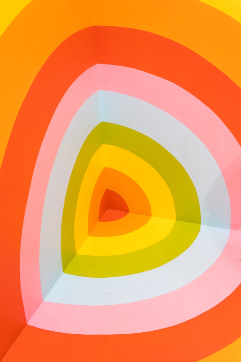
Discovering the Beauty of Color Palette Pairings: A Comprehensive Guide
In the world of design, whether it’s for interior decoration, graphic design, or fashion, the right color palette can transform an ordinary project into an extraordinary masterpiece. This article explores the art of color palette pairings, helping you understand how to blend colors effectively to convey the desired emotion, create harmony, and catch the eye.
The Importance of Color in Design
Color is a powerful tool in design. It affects mood, perception, and even decision-making. When choosing a color palette, it’s crucial to consider the psychological impact of colors, which can evoke feelings such as serenity with blues, energy with reds, and elegance with blacks. Hence, understanding color theory and effective pairings is vital.
Understanding Color Theory
At the core of color palette pairings is color theory, which explains how colors interact with one another. Here are the fundamental concepts:
- Primary Colors: Red, blue, and yellow are the basic colors that cannot be created by mixing other colors.
- Secondary Colors: Created by mixing primary colors. For example, mixing red and blue creates purple.
- Tertiary Colors: These are made by mixing a primary color with a secondary color, yielding more complex hues.
Creating Effective Color Palette Pairings
Choosing the right color palette involves understanding how colors complement or contrast with each other. Here are some popular methods for creating color pairings:
Monochromatic Color Schemes
A monochromatic color scheme uses variations in lightness and saturation of a single color. This method creates a harmonious and cohesive look.
| Advantages: Simple and elegant, easy to mix and match. |
| Disadvantages: May become dull without enough contrast. |
Complementary Color Schemes
Complementary colors are opposite each other on the color wheel. This pairing creates high contrast and vibrant looks, ideal for making elements stand out.
| Examples: Red and green, blue and orange. |
Analogous Color Schemes
Analogous colors sit next to each other on the color wheel. This approach creates serene and comfortable designs due to their natural harmony.
| Examples: Blue, green, and yellow-green. |
Popular Color Palette Pairings
Let’s explore some popular color palette pairings that can enhance your designs:
1. Classic Blue and Soft Coral
This pairing is fresh and uplifting. The calming effect of blue balances the warmth of coral.
2. Olive Green and Dusty Rose
A muted and earthy duo that works well in fashion and interior design, creating a sophisticated look.
3. Navy and Mustard Yellow
This combination brings a bold touch and is often used in contemporary designs, making it a favorite for branding and logos.
4. Neutrals with a Pop of Color
Neutral palettes (like grays, whites, and browns) become dynamic when paired with a vibrant color, such as bright red or teal.

Tools for Creating Color Palette Pairings
Several online tools can assist you in selecting the perfect color pairs:
- Adobe Color: A user-friendly platform to explore and create color schemes based on various rules of color theory.
- Coolors: A fast and intuitive color scheme generator that allows you to save your palettes for future use.
- Canva Color Palette Generator: A helpful tool for designers, letting you extract color palettes from images.
Tips for Using Color Palette Pairings in Different Fields
Now that we've covered the essentials, let’s look at how to apply color palette pairings across different disciplines:
Graphic Design
In graphic design, strengths lie in bold contrasts and readability. Make sure to assess color blindness accessibility when selecting your palettes.
Interior Design
For interiors, consider the space's lighting and purpose. Lighter shades can make small rooms feel more extensive, while darker hues add a sense of coziness.
Fashion Design
Fashion is all about trend and personal expression. Keeping abreast of seasonal colors can help in making relevant palette choices for your clothing line.
Conclusion: The Key to Stunning Color Palette Pairings
Mastering color palette pairings is an invaluable skill that enhances any design project, allowing for targeted expression and emotion. Always consider the context of your design, the audience, and the message that different colors send. Experiment with various combinations, utilize online tools, and don’t hesitate to seek inspiration from art, nature, and even digital platforms.
In summary, pay attention to how colors relate to one another and the feelings they evoke. With practice, you can confidently create stunning color palette pairings that resonate with your audience and elevate your designs.
Remember: The right color combination can make all the difference. Embrace your creativity, and let color guide your design journey!