Exploring Stunning Color Schemes for Destination Weddings
Introduction to Destination Weddings
Destination weddings have become a popular choice for couples looking to create a memorable and unique experience away from their hometown. These weddings offer not only breathtaking views but also allow couples to select beautiful color schemes that complement their chosen locations. In this article, we will delve into various color schemes for destination weddings, discuss how to choose the perfect palette, and explore popular themes and styles.
Understanding the Importance of Color Schemes
Color schemes play a crucial role in setting the mood of your wedding. They help in creating an ambiance that reflects your personality and the theme of the event. A well-thought-out color palette can transform a simple venue into an enchanting space that resonates with your love story.
Factors to Consider When Choosing Color Schemes
| Factor | Details |
| Location | Consider the colors of the natural surroundings. |
| Season | Match colors with seasonal trends for a cohesive look. |
| Wedding Theme | Your theme can guide your color choices. |
| Personal Preferences | Choose colors that resonate with you as a couple. |
| Guests’ Comfort | Consider how colors will affect your guests' experience. |
Popular Color Schemes for Destination Weddings
Destination weddings allow for a variety of stunning color palettes that can enhance the beauty of the setting. Below are some popular color schemes you might consider:
1. Coastal Charm: Blues and Whites
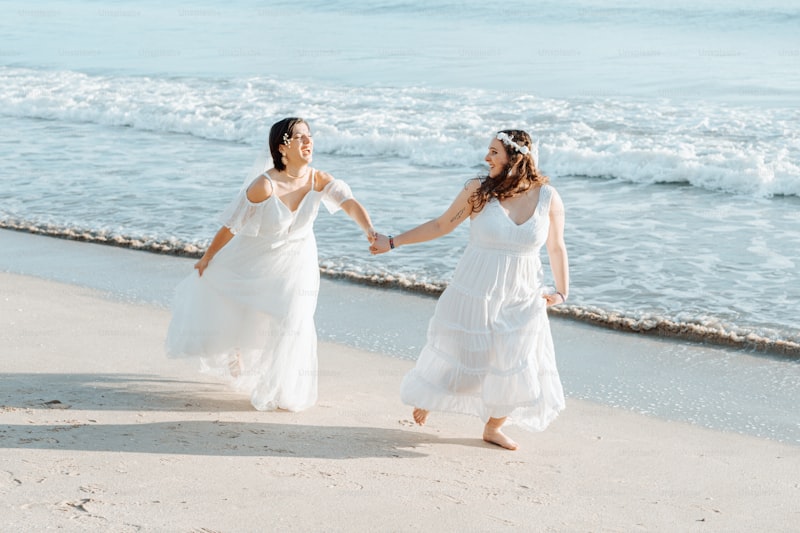
For beach weddings, a classic choice is a palette of blues and whites. These colors reflect the sea and sky, creating a serene and romantic atmosphere. Shades of teal, aqua, and crisp whites can be beautifully complemented with soft accents of sandy beige or coral.

2. Rustic Romance: Earth Tones
For destination weddings in the mountains or countryside, earthy tones like greens, browns, and rust can create a cozy and inviting feel. Use deep forest greens paired with muted browns and burnt orange to reflect the natural surroundings.
3. Tropical Vibes: Bright, Bold Colors
If you're heading to a tropical location, don't shy away from vibrant colors! Bright pinks, yellows, and oranges can create an energetic and lively atmosphere. Consider pairing these bold colors with crisp white for a balanced look.
4. Elegant Neutrals: Grays and Metallics
For a sophisticated wedding in a luxurious destination, opt for a neutral palette with shades of gray accented by metallics like gold or silver. This combination exudes elegance and can adapt to both indoor and outdoor settings.
5. Vintage Inspired: Pastels
Pastel colors, such as blush pink, lavender, and soft mint, evoke a vintage charm that’s perfect for romantic destination weddings. These gentle hues pair well with rustic venues or romantic beach settings.
Tips for Coordinating Your Color Scheme
Once you have a color scheme in mind, here are some tips to help you coordinate it across various aspects of your wedding:
1. Invitations and Save-the-Dates
Use your chosen color palette in your invitations and save-the-date cards. This sets the tone for your wedding and helps guests envision what to expect.
2. Attire
Your wedding attire, including the bridal gown, groom's suit, Bridesmaid dresses, and groomsmen ties, should reflect your selected colors. For instance, if you have a pastel palette, consider selecting Bridesmaid dresses in complementary shades.
3. Floral Arrangements
Flowers are a beautiful and impactful way to integrate your color scheme. Choose blooms that fit within your palette and consider seasonal availability to ensure the best quality.
4. Decorations and Venue Styling
Ensure that decorations, table settings, and venue styling are cohesive with your color choices. Think about linens, centerpieces, and backdrops that incorporate your colors.
5. Cake Design
Your wedding cake can be a stunning centerpiece that reflects your color scheme. There are numerous ways to incorporate color through fondant, flowers, or even decorative elements.
Conclusion and Final Recommendations
Choosing the right color scheme for your destination wedding is essential for creating the desired atmosphere and ensuring all elements of your celebration are cohesive. Whether you opt for a beachy blue and white palette or an elegant neutral scheme, the right colors will enhance your special day. Here are a few final tips:
- Be mindful of your location's natural colors. They can guide your choices and provide inspiration.
- Consider your guests and the overall vibe you want to create.
- Don’t hesitate to blend multiple colors, as long as they harmonize together.
- Consult with a wedding planner for guidance on color trends and adapting to your venue.
Ultimately, your destination wedding is a celebration of love. Choose a color scheme that reflects your journey together, ensuring it’s not just visually appealing, but deeply meaningful as well.