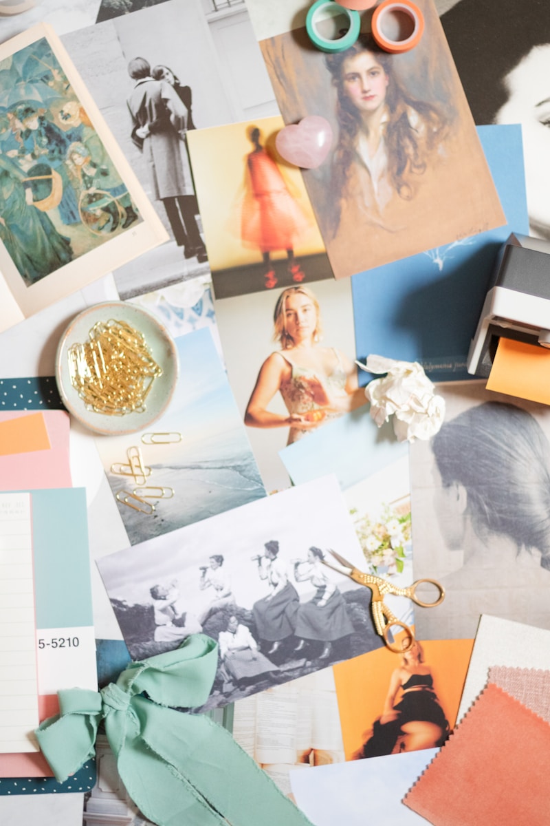
Daring Color Combinations: Unlocking Creative Possibilities in Design
Exploring Daring Color Combinations
When it comes to design, whether it’s in fashion, interiors, graphic design, or branding, color plays a crucial role. The way colors interact can evoke emotions, influence perceptions, and ultimately define a brand's identity. Among the various approaches to color theory, daring color combinations stand out for their ability to capture attention and convey a strong message. In this article, we will delve into what makes color combinations daring, how to implement them effectively, and some real-world examples that shine a light on this colorful approach.
What Are Daring Color Combinations?
Daring color combinations refer to the bold pairing of colors that might typically be seen as incompatible or unconventional. These combinations can create a striking visual impact and evoke strong emotional responses. When done right, they can transform everyday designs into extraordinary experiences. Think of colors like hot pink paired with forest green, or electric blue with a vibrant orange; these are bold choices that not only demand attention but also inspire creativity.
The Psychology Behind Color Choices
Understanding the psychology of colors is essential when exploring daring combinations. Each color carries its emotions and associations. For instance:
| Color | Emotion | Association |
| Red | Passion, energy | Love, urgency |
| Blue | Calmness, trust | Professionalism, tranquility |
| Yellow | Joy, optimism | Happiness, caution |
| Green | Growth, harmony | Nature, freshness |
| Purple | Lavishness, creativity | Royalty, mystery |
When choosing colors, designers often consider the emotional responses each color might evoke when combined. This understanding can guide the selection of daring color combinations, ensuring they are not only striking but also meaningful.
How to Create Daring Color Combinations
1. Understanding Color Theory
Before diving into daring combinations, it’s essential to have a solid grasp of color theory. Familiarize yourself with the color wheel, which includes primary, secondary, and tertiary colors. Understanding complementary, analogous, and triadic color schemes can serve as a foundation for experimenting with bolder choices.
2. Start with a Base Color
Select a base color that resonates with your project. From there, explore potential accent colors that can either complement or contrast with the base. Tools like Adobe Color or Coolors.co can help you visualize your combinations.
3. Experiment with Shades and Tints
Don’t hesitate to play with different shades (darker variations) and tints (lighter variations) of your selected colors. This can add depth and complexity to your daring combinations while maintaining harmony.
4. Consider the Context
The context in which your colors will be used is crucial. For example, a bright and energetic combination might work well for a children’s brand but could feel out of place in a luxury setting. Tailoring your combinations to your audience and purpose is key to making the boldest choices work.
5. Limit the Palette
While it may be tempting to use several colors in a single design, too many can become overwhelming. Aim for a maximum of three to four colors in a daring combination to maintain clarity and impact.

Real-World Applications of Daring Color Combinations
Several brands have successfully employed daring color combinations to create memorable designs. Let’s look at some inspiring examples:
1. Airbnb
Airbnb has become synonymous with adventure and exploration. Their use of a bright coral pink against muted greys and whites stands out and evokes a sense of community and warmth, making it inviting for users.
2. Spotify
Spotify’s interface is a masterclass in daring combinations, using vivid greens and blacks that make the content pop. This combination not only enhances readability but also contributes to their unique brand identity.
3. Guacamole
Graphic design portfolios often showcase daring color combinations. A standout graphic designer may use colors like lime green, fiery red, and cool violet to create eye-catching artwork that draws viewers in.
Challenges of Daring Color Combinations
While daring color combinations can be striking, they can also present their own set of challenges:
1. Risk of Clashing
Bold colors, if not balanced properly, can clash, leading to a chaotic design. It’s important to assess how colors interact and ensure they harmonize rather than compete.
2. Audience Perception
What may seem daring to one audience might be perceived as distasteful to another. Understanding your audience's preferences and cultural influences is crucial to implementing daring combinations successfully.
3. Trends vs. Timelessness
Some daring color combinations may be trend-driven and not age well. It’s essential to find a balance that allows for creativity while still being relevant in the long term.
Advice for Designers Seeking Daring Color Combinations
As you venture into the world of daring color combinations, keep these tips in mind:
- Research: Look for inspiration in nature, art, and design trends.
- Test:** Experiment with color swatches to see how different combinations look in various settings.
- Feedback: Share your designs with peers or clients for constructive criticism.
- Adapt: Be willing to adjust your combinations based on feedback or results.
Conclusion
Daring color combinations can breathe life into a design, making it not only visually appealing but also thought-provoking. By understanding color theory, experimenting with shades and contrasts, and considering audience perception, you can harness the power of daring color combinations to create impactful designs. Always remember to stay adaptable and open to feedback, as the world of design is ever-evolving. Embrace the possibilities of color, and let your creativity shine with daring combinations that make a statement!
In summary, daring color combinations are a powerful tool for any designer looking to make a mark. Embrace creativity, practice, and experimentation, and you might find your next masterpiece waiting to be discovered in a palette of daring colors!