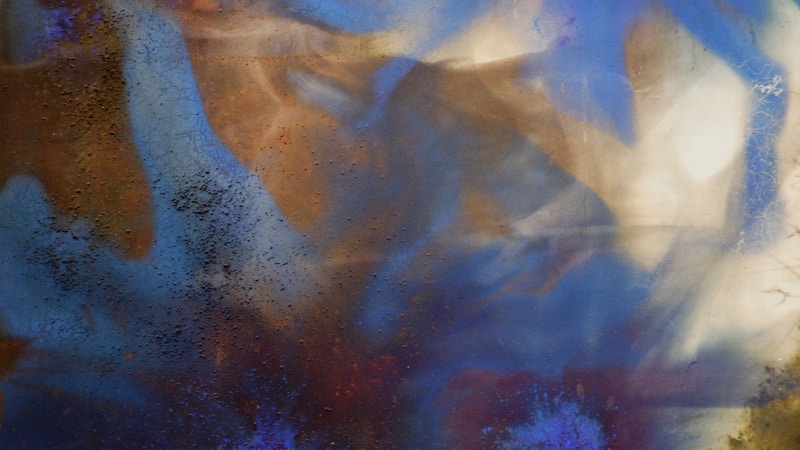
Mastering Harmonious Color Blending: A Guide for Artists and Designers
Understanding Harmonious Color Blending
In the world of art and design, understanding how to create visually appealing compositions is crucial. One of the key aspects that artists and designers must master is harmonious color blending. This process involves combining colors in a way that is pleasing to the eye while conveying the intended message or emotion. In this article, we will explore the concept of harmonious color blending, its importance, and practical methods for achieving it.
The Basics of Color Theory
Before delving into harmonious color blending, it's essential to have a grasp of color theory. Color theory is a framework for understanding how different colors interact with each other and the emotional responses they evoke. Here are some fundamental concepts:
| Color Wheel | A circular diagram of colors arranged according to their relationships. |
| Primary Colors | Red, blue, and yellow, which cannot be created by mixing other colors. |
| Secondary Colors | Green, orange, and purple, formed by mixing primary colors. |
| Tertiary Colors | Colors formed by mixing a primary color with a secondary color. |
The Importance of Harmonious Color Blending
Harmonious color blending is vital in various fields, including graphic design, interior decorating, and fine arts. Effective blending of colors can enhance the aesthetic appeal of a work, guiding the viewer’s emotions and perceptions. Here are a few reasons why mastering this skill is important:
- Emotional Impact: Certain color combinations can evoke feelings of calmness, excitement, or anxiety.
- Brand Identity: In graphic design, colors are pivotal in establishing a brand's identity and message.
- Visual Harmony: Harmonious blends create a pleasing visual experience that attracts and retains the audience's attention.
Methods for Achieving Harmonious Color Blending
Now that we understand the significance of harmonious color blending, let's explore some practical methods to achieve it:
1. Use a Color Palette
Creating a color palette involves selecting a specific range of colors that work well together. This could involve:
- Monochromatic Schemes: Utilizing different shades and tints of a single color.
- Analogous Colors: Choosing colors that are next to each other on the color wheel.
- Complementary Colors: Selecting colors opposite each other on the color wheel, which can create high contrast.
2. The 60-30-10 Rule
This design principle suggests dividing color usage into three areas: 60% dominant color, 30% secondary color, and 10% accent color. This rule helps maintain balance and harmony in your color schemes.
3. Experiment with Gradients
Gradients blend colors smoothly from one shade to another, creating a visually interesting effect. Consider using gradients in backgrounds or elements to add depth.
4. Pay Attention to Context
The context in which colors are used is crucial. Historical significance, cultural influences, and target audience preferences can all affect color choices. For instance, while yellow may evoke feelings of happiness in Western cultures, it can signify caution in others.
Common Challenges in Color Blending
Even with a strong understanding of color theory, blending colors harmoniously can be challenging. Here are some common pitfalls to avoid:
- Over-saturation: Using too many vibrant colors can create a chaotic and overwhelming effect.
- Lack of Contrast: Insufficient contrast among colors can lead to a flat appearance, causing visual fatigue.
- Ignoring Lighting: Natural and artificial light can drastically change how colors appear; always test under lighting conditions similar to the final environment.
Inspiration and Resources
Inspiration for harmonious color blending can come from various sources:
- Nature: Observing the colors in your surroundings can provide insight into natural color harmonies.
- Artworks: Studying masterpieces from famous artists can inspire your own color blending techniques.

- Online Tools: Platforms like Adobe Color or Coolors can help create palettes.
Conclusion: The Art of Harmonious Color Blending
Mastering the art of harmonious color blending requires practice and a strong understanding of color theory. As you experiment with different techniques, remember to stay mindful of the emotions and messages that your color choices convey. To achieve the best results, consider using the methods outlined above, while also seeking inspiration from various sources. Lastly, always pay attention to context and the intended audience to ensure your color palette resonates well. With consistent practice, you'll be able to create visually stunning artworks that leave a lasting impression.
Final Suggestions
As you embark on your journey to master harmonious color blending, take the time to analyze the color choices of successful artists and designers. Experiment continuously, and don't be afraid to make mistakes; they are often the best teachers. Remember that art is subjective—what resonates with one person may not resonate with another, so embrace your unique creative style while mastering the principles of color harmony.