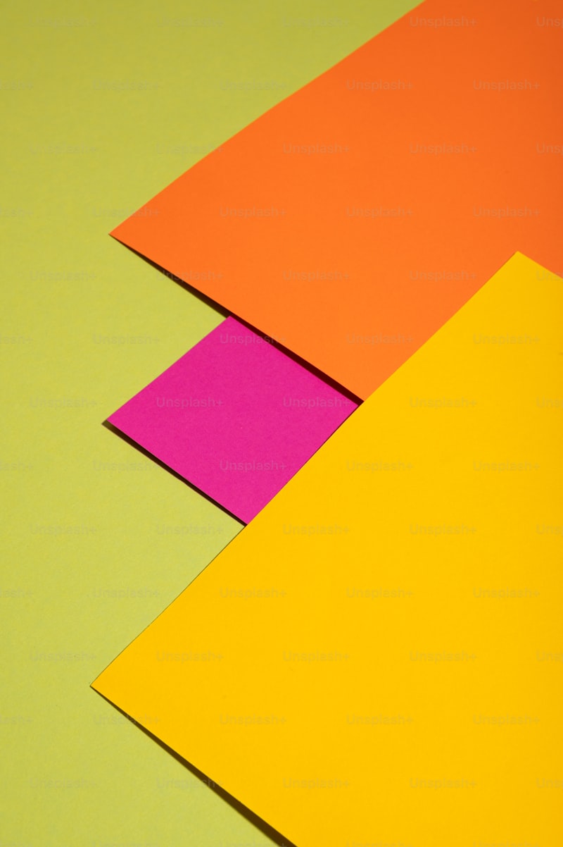
Exploring the Symphony of Colors in Arrangements: A Guide to Vibrant Design
The world of design is a fascinating realm where creativity meets expression. One of the most captivating aspects of design is the way colors interact and harmonize with one another. This phenomenon, often referred to as the 'Symphony of Colors in Arrangements,' plays a crucial role across various domains, from interior design to graphic arts. Understanding how to use color effectively can transform any project, making it visually appealing and emotionally resonant. In this article, we will delve deep into the significance of colors, their psychological impacts, and offer practical tips on how to create arrangements that sing with vibrancy.
Understanding Color Theory
Before exploring arrangements, it’s essential to grasp the basics of color theory. This framework aids designers in understanding how colors relate, how they can be combined, and the emotional impacts they have on viewers. Below are some fundamental concepts:
| Primary Colors | Red, Blue, Yellow |
| Secondary Colors | Green, Orange, Purple |
| Tertiary Colors | Mix of primary and secondary colors (e.g., Red-Orange, Yellow-Green) |
Primary colors are the building blocks of all other colors. By mixing these, designers create secondary colors, and further mixing leads to tertiary colors. This ability to create a broad spectrum of colors from just three primary ones constitutes the essence of the 'Symphony of Colors in Arrangements.'
The Psychological Impact of Colors
Colors are more than just aesthetics; they evoke feelings and convey messages. Here’s how different colors can influence perception:
- Red: Often associated with passion, energy, and action. It can evoke strong emotions and increase heart rates.
- Blue: Represents calmness, serenity, and trust. It is frequently used in corporate designs.
- Yellow: Associated with happiness and optimism, but too much can be overwhelming.
- Green: Symbolizes nature, tranquility, and stability. It’s a versatile color for peaceful arrangements.
- Purple: Often linked to luxury, creativity, and mystery. It can add a luxurious feel to any design.
Combining Colors: The Art of Arrangement
To create a melody of colors in your design, understanding color harmony is vital. Here are some popular color schemes that you can adopt:
- Monochromatic: Using different shades and tints of a single color creates a cohesive look.
- Analogous: Selecting colors that are next to each other on the color wheel results in harmonious designs.
- Complementary: Combining colors from opposite sides of the wheel adds contrast and vibrancy to arrangements.
- Triadic: Utilizing three colors evenly spaced on the wheel to achieve a dynamic effect.
Choosing the right combination can enhance the impact of your arrangement, invoking the intended mood and response from viewers. For instance, a monochromatic scheme can instill a sense of tranquility, while a complementary scheme might create excitement and energy.

Practical Tips for Implementing a Symphony of Colors
Now that we understand the fundamentals of color theory and its psychological implications, let’s explore some practical strategies for implementing a 'Symphony of Colors in Arrangements':
1. Take Inspiration from Nature
Nature is a master of color arrangements. Observe how colors blend in landscapes or flowers. Utilize these combinations as inspiration for your designs.
2. Use Tools and Resources
There are numerous tools available, such as Adobe Color, Coolors, and Paletton, that can help you experiment with color combinations before finalizing your arrangement.
3. Consider the Space
When working with interior designs, consider how colors will play in different lighting conditions. Natural light can alter how colors appear, so always test them in the intended environment.
4. Balance is Key
Finding the right balance between colors is essential. Use a dominant color, a secondary color and an accent color to create an aesthetically pleasing arrangement.
5. Gather Feedback
Don’t shy away from seeking feedback on your color choices. What resonates with you may not resonate with your audience. Gathering various perspectives can lead to stronger arrangements.
Common Questions About Color Arrangements
As you venture into the world of colors, you may find yourself asking a few common questions:
- What is the best way to learn about color theory? There are many online courses, books, and tutorials that can help you grasp color theory more effectively.
- How do cultural perceptions of colors differ? Different cultures can have various associations with colors; for example, white is often seen as a color of purity in Western cultures but is associated with mourning in many Eastern cultures.
- How do I choose a color palette for my brand? Consider your brand identity, target audience, and the emotions you want to evoke. Research competitor brands to see how they utilize colors.
Conclusion: The Beauty of Color Arrangements
In conclusion, the 'Symphony of Colors in Arrangements' is an intricate dance that relies on color theory, psychological impact, and effective application. By understanding color combinations and their meanings, designers can create visually stunning arrangements that resonate with their audience. Whether you are designing a room, creating a marketing campaign, or beautifying a graphic, the thoughtful application of colors can elevate your work to new heights. Take the time to explore, experiment, and enjoy the boundless possibilities that colors offer. Remember, the world is a canvas, and you are the artist—let your creativity flow and create your unique symphony!