Unlocking Creativity with Vibrant Color Palettes: A Comprehensive Guide
Color is a powerful tool in design, influencing our emotions and perceptions. Choosing the right color palette can elevate a project, whether it's for graphic design, interior decoration, fashion, or digital branding. In this article, we will explore the concept of Vibrant Color Palettes, and how they can enhance your work, as well as provide practical tips on selecting the perfect palette for your needs.
What are Vibrant Color Palettes?
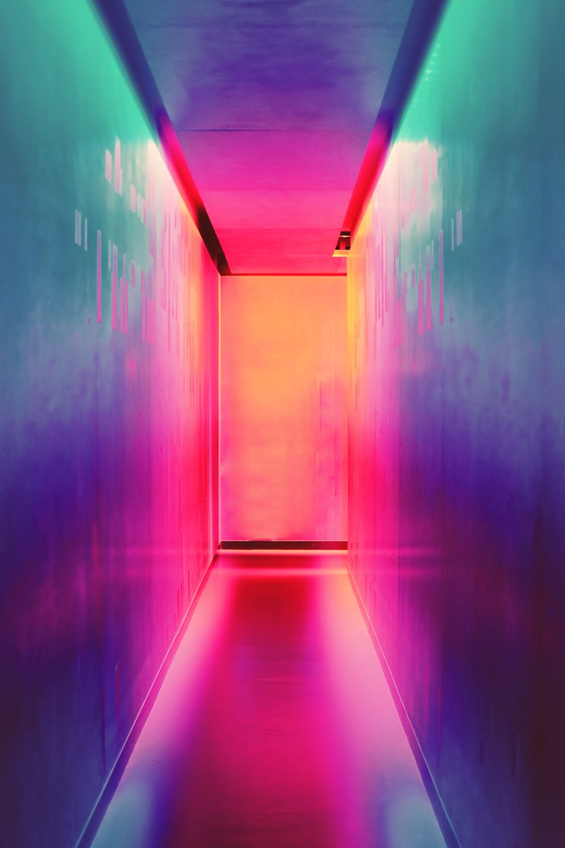
Vibrant color palettes comprise bold, bright colors that catch the eye and capture the imagination. These colors can convey energy, positivity, and enthusiasm, making them excellent choices for brands and projects that aim to stand out. Examples of vibrant colors include electric blue, fiery red, sunny yellow, and vivid green.
Why Use Vibrant Color Palettes?
Incorporating vibrant color palettes can have several benefits:
- Attract Attention: Bright colors naturally draw the eye, making your project more noticeable.
- Evoking Emotions: Specific colors can evoke different emotional responses; for instance, red often symbolizes passion or excitement, while yellow can evoke happiness.
- Creativity and Innovation: Vibrant colors stimulate creativity, making them perfect for creative projects.
How to Choose the Right Vibrant Color Palette
Choosing a color palette is crucial for your project's success. Here are some tips to help you select the right combination of vibrant colors:
1. Understand Color Theory
Familiarize yourself with the basics of color theory, including the color wheel, complementary colors, and analogous colors. Understanding how colors interact can help you create harmonious palettes.
2. Define the Project's Mood and Purpose
Consider the emotions you want to evoke. For a playful vibe, you might choose a vibrant palette with colors like bright pink and turquoise, while a more serious tone may benefit from rich jewel tones.
3. Test Combinations
Experiment with various combinations using design software or online palette generators. This step can help you visualize how colors work together in practice.
4. Consider Your Audience
Think about who your target audience is and what colors resonate with them. A vibrant color palette for a children's brand might differ significantly from one aimed at adults.
Examples of Vibrant Color Palettes
Below is a table summarizing several popular vibrant color palettes used in different contexts:
| Palette Name | Colors | Best For |
| Sunset Vibes | Coral, Sandy Yellow, Turquoise | Beach-themed projects, summer events |
| Pop Art | Hot Pink, Electric Blue, Bright Yellow | Youthful brands, modern artwork |
| Urban Jungle | Vivid Green, Bright Orange, Charcoal Gray | Eco-friendly products, modern design |
| Retro Rainbow | Bright Red, Lemon Yellow, Sky Blue, Grass Green | Vintage style, nostalgia-themed designs |
Designing with Vibrant Color Palettes
Once you have selected your vibrant color palette, it's time to implement it in your design effectively. Here are some tips for using vibrant colors in your projects:
1. Use Color Hierarchy
Not all colors need to be prominent in your design. Use a primary color to dominate the layout and accent with secondary colors. This approach will create a visual hierarchy and guide audience attention.
2. Balance with Neutrals
To prevent overwhelming viewers, balance vibrant colors with neutral tones such as white, gray, or beige. This balance allows vibrant colors to shine without becoming too chaotic.
3. Consider the Context
Ensure that your vibrant colors are appropriate for the context of your design. For instance, vibrant colors may work well for a children's toy advertisement but may not convey seriousness for a financial services landing page.
4. Maintain Consistency Across Platforms
If you’re designing for digital and print, ensure that your color palette translates well across all platforms. Test how colors appear in different settings—like a computer screen versus printed materials.

Trends in Vibrant Color Palettes
As design is ever-evolving, so too are color trends. Currently, several vibrant palettes are popular among designers:
- Gradient Blends: Combining vibrant colors in gradients can create visually stunning designs that attract attention.
- Retro Influence: Nostalgic colors reminiscent of past decades return, often blended with modern design elements.
- Nature-Inspired Colors: Colors derived from nature, such as bright floral shades or vivid foliage, reflect a growing trend towards sustainability and environmental consciousness.
Conclusion and Recommendations
In conclusion, vibrant color palettes are not just visually appealing; they can also effectively convey messages and emotions, enhance brand identity, and make designs more engaging. When selecting a vibrant color palette, consider the project’s purpose, target audience, and the psychological impact of colors. Remember to maintain a balance, use color hierarchy, and keep your design consistent across various platforms.
By embracing vibrant colors in your designs, you can unlock new levels of creativity and impact. Happy designing!