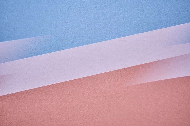
Exploring the Allure of Romantic Color Gradients in Design
Introduction to Romantic Color Gradients
In the world of design, color plays a crucial role in evoking emotions and setting the tone of any project. Among various color techniques, romantic color gradients have gained significant popularity in recent years, particularly in digital art, website design, and branding. This article delves into the concept of romantic color gradients, their applications, and how to effectively use them to enhance your designs.
Understanding Romantic Color Gradients
Romantic color gradients are blends of colors that create a soothing and harmonious effect. They are often composed of soft hues such as pastel pinks, purples, blues, and other gentle tones that evoke feelings of love, nostalgia, and tranquility. These gradients can be used in various media, including web design, mobile applications, marketing materials, and artwork.
Key Characteristics of Romantic Color Gradients:
- Soft, gentle transitions between colors
- Use of warm and cool tones to create depth
- Incorporation of complementary colors for balance
- Evokes feelings of romance, peace, and nostalgia
Applications of Romantic Color Gradients
Romantic color gradients serve numerous functions in design, enhancing both aesthetics and emotional appeal. Some common applications include:
| Application | Description |
| Web Design | Used in background images to create a soft, inviting atmosphere. |
| Social Media Graphics | Enhances posts and stories, making them more visually appealing. |
| Branding | Establishes a brand's identity by evoking the desired emotions. |
| Event Invitations | Casts a romantic theme, suitable for weddings or anniversaries. |
The Psychology Behind Color Gradients
Colors can significantly influence our emotions and perceptions. Romantic color gradients, with their soothing transitions, can create feelings of warmth and connection. According to color psychology:
- Pink: Represents love, compassion, and harmony.
- Blue: Evokes trust, peace, and calmness.
- Purple: Associated with creativity, spirituality, and luxury.
By understanding color psychology, designers can effectively choose gradients that resonate with their audience and convey the right message.
Creating Romantic Color Gradients
When it comes to creating romantic color gradients, there are several factors to consider:
- Choose Your Palette: Start with a selection of soft colors that complement each other.
- Use Design Tools: Utilize design software such as Adobe Illustrator or online gradient generators to experiment with your color transitions.
- Test in Context: Always test your gradients in the actual design context to see how they interact with other design elements.

Trends in Romantic Color Gradients
In recent years, romantic color gradients have evolved with various trends. Designers are increasingly blending modern techniques with classic aesthetics to create visually stunning results. Some emerging trends include:
- minimalist Gradient Backgrounds: Clean, simple designs that incorporate subtle gradients to add depth without overwhelming the viewer.
- Color Overlays: Using transparent gradients over images to create a romantic feel without losing the impact of the photo.
- Animated Gradients: Gradually changing background colors that capture attention and add a dynamic element to web designs.
Challenges in Using Color Gradients
While romantic color gradients can greatly enhance a design, they come with their own set of challenges:
- Overuse: Excessively using gradients can lead to overwhelming designs. It's important to strike a balance.
- Compatibility: Gradients may not be suitable for all design elements or contexts. Ensure they align with the overall design strategy.
- Accessibility: Color choices should consider people with visual impairments. Always check contrast to ensure readability.
Conclusion: The Future of Romantic Color Gradients
In conclusion, romantic color gradients are a powerful design tool that can evoke strong emotional responses and enhance visual appeal. As design trends continue to evolve, incorporating these gradients thoughtfully will be essential to stay relevant. Designers should experiment with various palettes and techniques while keeping in mind the principles of color psychology to create meaningful and captivating designs. As you embark on your design journey, remember that a well-placed romantic gradient could transform the ordinary into the extraordinary, creating works that resonate deeply with your audience.
Suggestions: Always test your color choices in real-world applications. Seek feedback from peers or your target audience to ensure your gradients achieve the desired effect. Additionally, stay updated on design trends to continuously evolve your graphic style.